Choosing a wedding color palette is one of the earliest decisions many couples make, and from my experience, it is also one of the most important. Your wedding colors influence nearly every visual detail, from the invitations and floral arrangements to the bridal party attire, reception décor, and even the photographs you’ll treasure for years. A carefully selected color combination creates harmony throughout the entire celebration and helps establish the atmosphere you want your guests to experience.
While wedding trends constantly evolve, not every trend deserves a place in your wedding. Some colors become incredibly popular for a year or two before quickly feeling outdated. Others have stood the test of time, appearing in elegant weddings across generations while still looking fresh and sophisticated today. Those are the color combinations worth considering if you want your wedding to remain beautiful decades from now.
I have seen couples regret choosing colors simply because they were trending on social media. The excitement of following a trend often fades much faster than expected, especially when looking back through wedding albums years later. Timeless wedding color combinations, on the other hand, never lose their charm. They provide a classic foundation while still allowing plenty of room to personalize your celebration.
Another advantage of classic color palettes is their incredible flexibility. Whether you’re planning a grand ballroom reception, a rustic barn wedding, a beach ceremony, or an intimate garden celebration, timeless colors naturally adapt to different venues and decorating styles. Instead of competing with your surroundings, they enhance them.
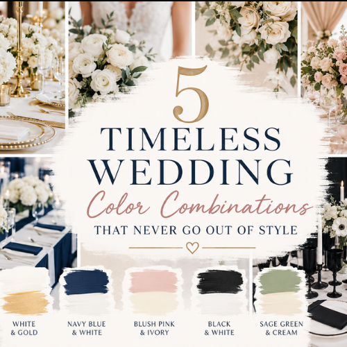
If you’re searching for wedding colors that will look elegant in every season, photograph beautifully, and never feel outdated, this guide will help you make a confident decision. Below are five timeless wedding color combinations that continue to inspire unforgettable celebrations year after year.
How to Choose a Timeless Wedding Color Palette
Before falling in love with a specific color combination, it’s important to understand what actually makes a wedding palette timeless. In my experience, the most successful weddings aren’t necessarily the ones with the boldest colors—they’re the ones where every design choice works together naturally.
Start by considering the overall atmosphere you want to create. Do you imagine a romantic garden ceremony filled with soft florals? A luxurious ballroom reception with sparkling chandeliers? Or perhaps a relaxed outdoor celebration surrounded by nature? Your venue should influence your color choices rather than compete against them.
Lighting also plays a major role. Natural daylight, candlelight, and evening receptions all affect how colors appear. Soft neutrals often glow beautifully during golden hour, while darker shades create dramatic elegance during nighttime celebrations. Thinking about your ceremony and reception lighting ahead of time can help you avoid unpleasant surprises.
Another mistake I often see is selecting too many colors. A timeless wedding palette usually consists of two primary colors, supported by one or two accent shades. Keeping your palette simple creates consistency throughout every detail, making your wedding appear professionally designed instead of visually overwhelming.
Your season matters as well, although classic color combinations work all year with small adjustments. For example, sage green and cream feel fresh during spring and summer but become warm and sophisticated when paired with deeper greenery in autumn. White and gold remain equally stunning whether you’re hosting a winter wedding or a summer celebration.
Don’t forget to think about your photographs. Wedding photos last far longer than flowers or decorations, so choosing colors that photograph well is essential. Neutral and balanced color palettes tend to age much better than extremely bright or trendy shades, ensuring your wedding album still looks elegant decades from now.
Finally, trust your personal style more than temporary trends. Your wedding should reflect your relationship, not simply what’s currently popular online. Timeless colors provide the perfect balance between classic beauty and personal expression.
1. White and Gold
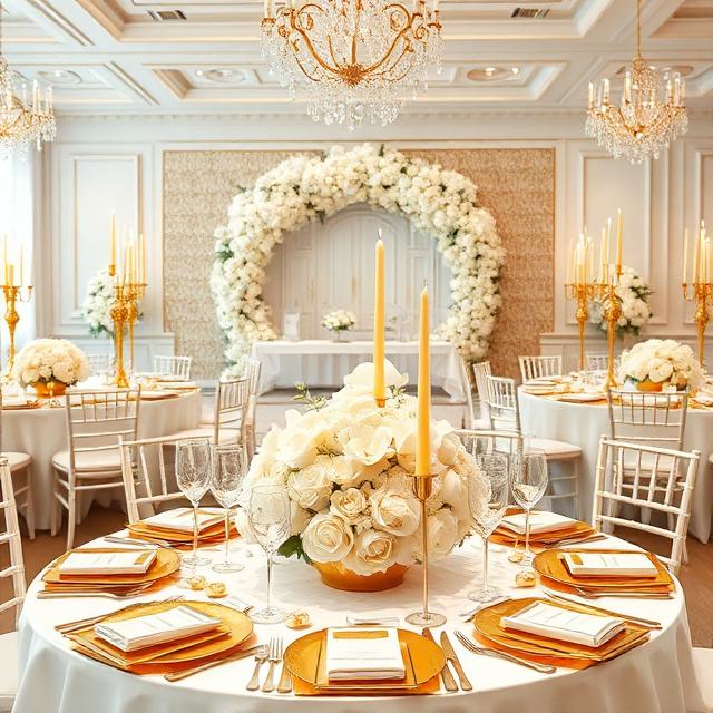
Few wedding color combinations communicate elegance as effortlessly as white and gold. This pairing has remained a favorite for generations because it creates a luxurious atmosphere without feeling excessive. Whether your wedding style is traditional, modern, minimalist, or glamorous, white and gold naturally complement almost every design choice.
White symbolizes purity, new beginnings, and simplicity, while gold introduces warmth, sophistication, and celebration. Together, they produce a refined appearance that feels expensive without requiring an extravagant budget. Even modest wedding venues can appear elevated when decorated with this timeless combination.
One reason I frequently recommend white and gold is its remarkable versatility. White flowers such as roses, peonies, orchids, and hydrangeas pair beautifully with gold candle holders, elegant table settings, metallic signage, and subtle decorative accents. Instead of overwhelming the space, the gold simply highlights the clean beauty of the white elements.
Imagine walking into a reception where crisp white linens cover every table, soft candlelight reflects from gold charger plates, delicate floral centerpieces fill the room with elegance, and warm lighting creates a luxurious glow throughout the venue. The overall impression feels sophisticated rather than trendy, making every photograph look effortlessly timeless.
This palette also works exceptionally well with bridal fashion. White wedding gowns naturally become the centerpiece, while gold jewelry, hair accessories, and even bridal shoes provide subtle finishing touches. Bridesmaids can wear champagne, gold, or soft neutral dresses without taking attention away from the bride.
If you’re worried that white and gold may appear too formal, you can soften the look by incorporating natural greenery, textured fabrics, or wooden accents. These additions create warmth while preserving the timeless elegance that makes this color combination so popular.
2. Navy Blue and White
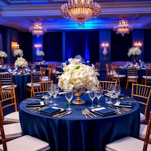
Navy blue and white represent one of the most dependable wedding color combinations available. Unlike brighter shades of blue that come and go with fashion trends, navy has consistently remained associated with sophistication, confidence, and timeless style.
I appreciate this palette because it creates strong visual contrast without becoming overwhelming. The crisp brightness of white perfectly balances the richness of navy, resulting in décor that feels polished from every angle. This balance makes the combination suitable for nearly every wedding theme, from elegant coastal ceremonies to luxurious hotel receptions.
One of the greatest strengths of navy blue is its flexibility across every season. During spring and summer, it creates a fresh nautical-inspired atmosphere when paired with white florals and natural greenery. In autumn and winter, it becomes richer and more dramatic, especially when accented with silver, gold, or candlelight.
For example, imagine a formal evening wedding where the groom and groomsmen wear tailored navy suits, the bridesmaids wear elegant navy dresses, white roses fill the floral arrangements, and soft candlelight illuminates the reception tables. The overall aesthetic feels refined, memorable, and effortlessly stylish without relying on temporary trends.
Navy blue also performs exceptionally well in wedding photography. Because it provides depth and contrast, it helps white dresses, floral arrangements, and decorative details stand out beautifully in both daylight and evening photographs. This creates wedding albums that continue looking modern long after current trends have disappeared.
Another advantage is accessibility. Finding navy suits, dresses, linens, stationery, ribbons, candles, and decorative accessories is relatively easy, making this one of the simplest timeless palettes to coordinate without significantly increasing your wedding budget.
Couples who want a classic wedding with just enough boldness often find navy blue and white to be the perfect middle ground. It offers elegance without feeling overly traditional and sophistication without becoming overly dramatic.
3. Blush Pink and Ivory
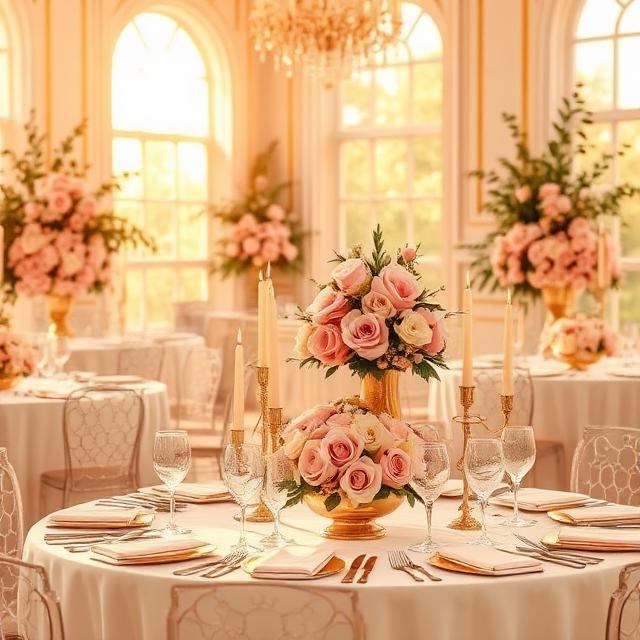
Blush pink and ivory have earned their place among the most timeless wedding color combinations because they create an atmosphere of effortless romance. While brighter pink shades have gone in and out of fashion over the years, blush has remained consistently elegant. It is soft without being overly feminine and sophisticated without appearing dull.
I often recommend this palette to couples who want their wedding to feel warm, welcoming, and graceful. Blush introduces just enough color to add personality, while ivory provides a rich neutral base that feels softer than bright white. Together, they create a balanced palette that suits almost every wedding style.
This combination shines particularly well in outdoor venues. Picture a spring garden filled with blooming flowers, ivory ceremony chairs, blush rose petals lining the aisle, and delicate floral arrangements featuring roses, peonies, ranunculus, and hydrangeas. The colors blend naturally with the surroundings instead of competing against them.
Blush and ivory also transition beautifully indoors. In elegant ballrooms, these colors soften grand spaces, making them feel intimate and inviting. Paired with crystal chandeliers, candles, and subtle metallic accents, they create an atmosphere that guests remember long after the celebration ends.
One reason this palette has remained popular for decades is that it complements every skin tone. Bridesmaid dresses in blush are flattering on a wide range of complexions, while ivory flowers provide a timeless backdrop without overwhelming the bridal party.
For couples who want a little more depth, adding small accents of champagne, dusty rose, sage green, or gold can elevate the overall design while preserving the classic feel. These supporting colors introduce texture and visual interest without distracting from the main palette.
If your goal is to create a wedding that feels romantic today and just as beautiful twenty years from now, blush pink and ivory remain one of the safest and most elegant choices available.
4. Black and White
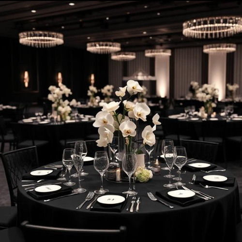
Few color combinations communicate timeless sophistication quite like black and white. Fashion designers have relied on this pairing for generations, and the same principle applies to weddings. It is clean, refined, dramatic, and effortlessly elegant.
Some couples hesitate because they associate black with formal occasions, but when used thoughtfully, it creates striking contrast that highlights every important detail. Instead of making the wedding feel dark, black frames the brighter elements and allows them to stand out even more.
Imagine an elegant ceremony featuring white floral arrangements against black aisle runners, crisp white linens accented with black napkins, sophisticated candlelight, and modern calligraphy on white stationery. Every design choice feels intentional and luxurious without relying on elaborate decorations.
Black tuxedos naturally fit this palette, giving the groom and groomsmen a polished appearance that never goes out of style. Meanwhile, the bride’s white gown becomes the undeniable focal point throughout the ceremony and reception.
Photography is another reason I appreciate this combination. Black and white create excellent visual contrast, helping important moments stand out with exceptional clarity. Even colorful floral bouquets appear more vibrant when surrounded by this classic backdrop.
This palette is incredibly adaptable. Couples planning modern city weddings often lean into sleek, minimalist décor with geometric details. Those hosting traditional celebrations can soften the look using abundant white flowers, romantic candlelight, and luxurious fabrics such as velvet or satin.
One common misconception is that black and white can feel cold. In reality, adding warm lighting, natural greenery, textured florals, or gold accents transforms the space into something welcoming and elegant without sacrificing the timeless aesthetic.
5. Sage Green and Cream
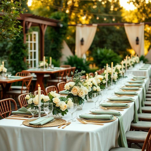
Sage green has quietly become one of the most enduring wedding colors in recent years, and I believe it has earned that reputation for good reason. Unlike bold shades that quickly become dated, sage offers a soft, earthy elegance that feels natural in every season.
When paired with cream, the result is a calming and refined color palette that blends beautifully into almost any venue. Whether you’re celebrating in a vineyard, botanical garden, countryside barn, mountain lodge, or elegant estate, these colors complement the environment instead of overpowering it.
Cream softens the cool undertones of sage green, creating a balanced palette that feels relaxed yet sophisticated. The combination works particularly well with organic floral arrangements, eucalyptus, olive branches, white roses, garden roses, and textured greenery.
Picture a ceremony beneath a floral arch filled with cascading greenery, cream-colored flowers, wooden chairs, flowing linen fabrics, and soft candlelight. The atmosphere feels intimate, fresh, and timeless without depending on trendy decorations.
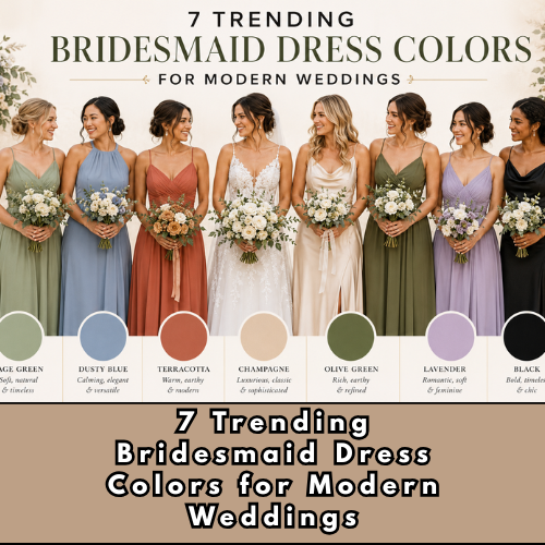
Another reason I frequently recommend sage green and cream is their versatility. Bridesmaids look stunning in sage dresses, while cream florals create beautiful bouquets that never appear overly busy. Table settings, signage, wedding favors, and invitations also coordinate effortlessly with this palette.
Seasonal flexibility is another major advantage. During spring and summer, sage feels light and refreshing. In autumn, it pairs naturally with dried florals and warm neutral tones. During winter weddings, cream flowers combined with evergreen foliage create a sophisticated seasonal look.
Couples who appreciate understated elegance often discover that sage green and cream provide exactly the balance they’re looking for—beautiful enough to impress guests while remaining timeless for years to come.
How to Make Classic Wedding Colors Feel Modern
Choosing timeless colors does not mean your wedding has to feel traditional or outdated. In fact, many of today’s most stylish weddings are built around classic color palettes with contemporary design choices.
One of the easiest ways to modernize timeless colors is through texture rather than additional colors. Linen tablecloths, handmade stationery, velvet ribbons, matte ceramics, and layered floral arrangements create visual depth without changing the palette itself.
Lighting also plays a significant role. Warm candles, hanging string lights, chandeliers, and carefully placed uplighting completely transform how classic colors appear throughout the venue. Even the simplest palette feels luxurious under thoughtful lighting.
Mixing materials can also create a fresh look. Combining glass, wood, stone, brushed metals, and natural fabrics introduces character while maintaining elegance. Rather than relying on bright colors, these materials create interest through contrast and texture.
Personal touches make an even bigger difference. Custom signage, meaningful table names, handwritten vows, family heirlooms, signature cocktails, and carefully selected music all contribute to a wedding that feels unique without abandoning timeless style.
The key is remembering that timeless colors provide the foundation. Your personality, décor choices, and thoughtful details are what transform that foundation into a celebration your guests will genuinely remember.
Read: 5 Best Creative Wedding Entrance Ideas for the Bride and Groom
Common Mistakes to Avoid When Choosing Wedding Colors
Even beautiful color combinations can lose their impact if they are not used thoughtfully. Over the years, I have noticed several common mistakes that couples make when selecting their wedding palette.
The first is trying to include too many colors. While it may be tempting to use every favorite shade, doing so often creates visual confusion. Limiting your palette to two primary colors with one or two supporting accents keeps the overall design cohesive.
Another mistake is ignoring the venue. Colors that look stunning in a bright garden may not have the same effect inside a dark ballroom. Always consider the architecture, lighting, and existing décor before finalizing your palette.
Many couples also focus entirely on social media trends. While online inspiration can be helpful, trends change quickly. Choosing colors simply because they are popular this year may leave your wedding looking dated much sooner than expected.
It’s equally important to request fabric, paint, and floral samples whenever possible. Colors often appear different in person than they do on a phone or computer screen. Seeing materials together under natural lighting helps prevent unexpected surprises.
Finally, don’t forget the practical side of planning. Some flowers, linens, and décor items are easier to source than others. Selecting timeless colors usually provides more flexibility, wider availability, and better pricing compared to niche seasonal trends.
Frequently Asked Questions (FAQ)
What is the most timeless wedding color combination?
White and gold are widely considered the most timeless wedding colors because they symbolize elegance, celebration, and sophistication. They suit nearly every venue and wedding style while remaining beautiful in photographs for decades.
Are neutral wedding colors becoming outdated?
Not at all. Neutral colors continue to be among the safest and most elegant choices for weddings. Rather than going out of style, they evolve through updated décor, textures, and styling techniques.
Can timeless wedding colors still feel unique?
Absolutely. The colors create the foundation, but your floral design, venue, lighting, stationery, attire, and personal details make the celebration distinctive. Two weddings can share the same color palette while looking completely different.
Should wedding colors match the season?
Matching the season can enhance your wedding, but it isn’t a requirement. Timeless palettes such as black and white, white and gold, or navy and white work beautifully throughout the year with only minor decorative adjustments.
How many colors should a wedding palette include?
Most professionally designed weddings use two main colors supported by one or two accent shades. This approach keeps the décor coordinated without making the overall design feel overwhelming.
Conclusion
Wedding trends will continue to evolve, but true elegance never disappears. Choosing a timeless wedding color combination means investing in a celebration that will look just as beautiful in your anniversary photos decades from now as it does on your wedding day.
Whether you’re drawn to the luxurious elegance of white and gold, the striking sophistication of black and white, the romantic charm of blush pink and ivory, the confident beauty of navy blue and white, or the organic appeal of sage green and cream, each palette offers lasting style that extends far beyond temporary trends.
As you begin planning your wedding, remember that colors do more than decorate a venue. They shape the atmosphere, influence your photographs, and help tell the story of one of life’s most meaningful celebrations. Choose a palette that reflects your personality, complements your venue, and creates the experience you’ve always imagined.
The most memorable weddings are rarely the ones chasing the latest trends. They’re the ones built on thoughtful decisions, timeless design, and genuine love—and those qualities never go out of style.

Daniel Master is a relationship and marriage writer passionate about helping readers build healthier relationships, stronger marriages, and more meaningful connections. Through practical advice, thoughtful insights, and fresh perspectives on weddings and modern relationships, Daniel creates easy-to-understand content designed to help readers make confident decisions in love and life.