Understanding balance and contrast in art is essential for anyone who wants to truly engage with visual work beyond surface-level appreciation. In my years working within gallery spaces and curatorial environments, I’ve observed that viewers respond instinctively to artworks long before they consciously analyze them. That instinctive reaction is often shaped by how balance and contrast are handled within a composition.
Balance and contrast are not decorative extras. They are foundational principles that determine whether an artwork feels calm or dynamic, unified or fragmented, engaging or forgettable. Even viewers without formal art training sense when something “feels right” or “feels off,” and that reaction is almost always tied to these two elements.
This article is designed to provide clarity. Rather than using overly academic language, the goal is to explain balance and contrast in a way that feels practical, insightful, and grounded in real artistic practice. Whether viewing a classical painting or a contemporary installation, understanding these principles transforms how art is seen and understood.
What Is Balance in Art? A Clear and Practical Explanation
Balance in art refers to how visual elements are arranged so that a composition feels stable and intentional. It does not mean everything must be evenly placed or perfectly mirrored. Instead, balance is about visual weight—how colors, shapes, textures, and forms interact across the artwork.
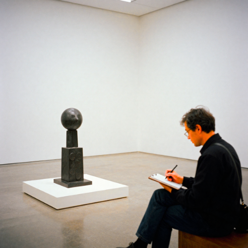
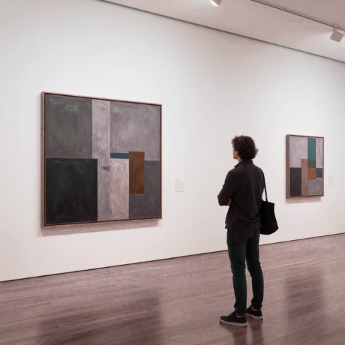
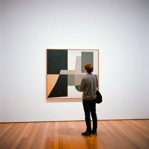
In gallery settings, I often notice that balanced artworks invite viewers to stay longer. The eye moves comfortably across the surface without feeling pulled too aggressively in one direction. This sense of stability helps the artwork communicate its message more effectively.
Balance can be subtle. A small, dark object can visually counterbalance a large, light area. A quiet space can be just as powerful as a detailed one. Artists who understand balance know how to distribute visual interest so that no single element overwhelms the rest unless intentionally designed to do so.
Types of Balance in Art and How They Work
One of the most common forms of balance is symmetrical balance. This occurs when elements are evenly distributed on either side of a central axis. Symmetry often conveys order, harmony, and formality. Many classical artworks, religious paintings, and architectural compositions rely on symmetry to create a sense of calm and authority.
Asymmetrical balance, on the other hand, is more dynamic. Instead of mirroring elements, artists balance contrasting visual weights. A bold shape on one side might be balanced by multiple smaller elements on the other. In contemporary art, asymmetrical balance is widely used to create movement and tension while still maintaining cohesion.
Radial balance occurs when elements radiate outward from a central point. This type of balance draws attention inward and then outward, creating a powerful focal experience. It is commonly seen in mandalas, rose windows, and circular compositions where the center holds symbolic or visual importance.
How Artists Use Balance to Guide the Viewer’s Eye
Balance plays a critical role in how the viewer navigates an artwork. When balance is handled skillfully, the eye moves naturally from one element to another, absorbing the composition as a whole rather than fixating on isolated parts.
In exhibitions, I’ve often observed how balanced artworks encourage slow viewing. The viewer’s gaze travels across the piece, discovering relationships between elements rather than rushing toward a single focal point. This creates a more immersive experience.
Artists use balance to control pacing. Areas of visual rest are just as important as areas of detail. Negative space, when balanced effectively, gives the eye time to pause and reflect, enhancing the overall impact of the artwork.
What Is Contrast in Art? Understanding Visual Difference
Contrast in art refers to the intentional use of difference to create visual interest and emphasis. Where balance stabilizes a composition, contrast energizes it. Contrast can be subtle or dramatic, but it always serves a purpose.
In gallery practice, contrast is often what initially captures attention. A sudden shift in color, value, or texture draws the eye immediately. This moment of visual tension is what invites the viewer to engage more deeply with the work.
Without contrast, artworks risk appearing flat or monotonous. Even minimalist compositions rely on some form of contrast, whether through scale, surface variation, or spatial relationships. Contrast gives artwork its voice and presence.
Common Types of Contrast in Art
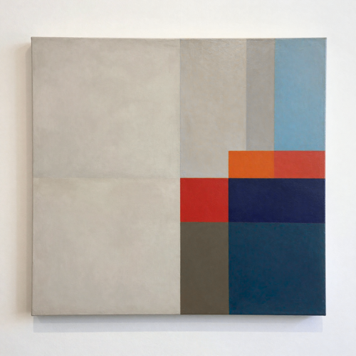
Color contrast is one of the most recognizable forms. Warm colors against cool colors, complementary hues placed side by side, or muted tones interrupted by a vivid accent all create visual excitement. Color contrast is especially effective in directing attention.
Value contrast refers to the difference between light and dark. Strong value contrast creates drama and depth, while subtle value shifts create softness and atmosphere. Many master artists relied heavily on value contrast to model form and emotion.
Texture contrast involves pairing smooth and rough surfaces, either physically or visually. Scale contrast plays with size differences, making certain elements feel dominant or secondary. Shape contrast combines organic and geometric forms to create tension and interest within the composition.
How Contrast Creates Emphasis and Visual Interest
Contrast is a powerful tool for emphasis. Wherever contrast is strongest, the eye is drawn first. Artists use this principle intentionally to highlight focal points, convey meaning, or suggest hierarchy within the artwork.
In professional gallery installations, lighting is often adjusted to enhance contrast already present in the artwork. This reinforces the artist’s intended focal areas and strengthens the viewer’s engagement.
Contrast also adds rhythm. By alternating areas of high and low contrast, artists create a visual flow that keeps the viewer engaged. The artwork feels alive, active, and emotionally resonant.
The Relationship Between Balance and Contrast in Art
Understanding balance and contrast in art requires recognizing that these principles work together, not against each other. Too much contrast without balance creates chaos. Too much balance without contrast creates boredom.
In strong artworks, contrast introduces energy while balance ensures coherence. One anchors the composition, the other animates it. This relationship is what separates compelling artworks from visually confusing ones.
From my experience in curatorial work, the most memorable pieces are those where balance and contrast are in constant dialogue. The artwork feels intentional, controlled, and expressive without feeling rigid or predictable.
Examples of Balance and Contrast in Famous Artworks
Some of the clearest lessons in understanding balance and contrast in art come from studying historically significant works. In classical paintings, balance is often achieved through carefully structured compositions, while contrast is introduced through light and shadow. These artists understood that restraint could be just as powerful as excess.
In Renaissance works, symmetrical balance frequently dominates the overall structure, creating a sense of harmony and permanence. Contrast appears through controlled variations in value and color, guiding attention to key figures or narrative moments. The viewer’s eye is never lost because every visual decision serves a purpose.
Modern and contemporary artworks often approach balance differently. Asymmetrical balance is more common, and contrast may be bold or even confrontational. Large areas of negative space may balance intense focal points, creating compositions that feel intentional yet emotionally charged. These works demonstrate how balance and contrast evolve with artistic language while remaining essential.
Balance vs. Contrast: Key Differences Explained Simply
Balance and contrast are often discussed together, but they serve different roles. Balance is about stability and distribution, while contrast is about difference and emphasis. Understanding this distinction helps clarify how each principle contributes to an artwork’s success.
Balance ensures that no part of the artwork feels visually isolated or accidental. It creates a sense of wholeness, allowing the viewer to experience the piece as a unified composition. Without balance, the artwork may feel unresolved or uncomfortable in unintended ways.
Contrast, by contrast, creates moments of focus. It tells the viewer where to look and what matters most. While balance holds the composition together, contrast gives it direction and emotional impact. Strong artworks rely on both working in harmony.
How Contemporary Artists Apply Balance and Contrast Today
In contemporary art, balance and contrast are often used to challenge expectations rather than reinforce tradition. Artists may deliberately disrupt balance to provoke discomfort or use extreme contrast to comment on social, cultural, or political themes.
Installation art frequently relies on spatial balance rather than traditional composition. The placement of objects within a room, the relationship between empty and occupied space, and the movement of the viewer all contribute to balance. Contrast may appear through material choices, lighting, or scale.
Digital and mixed-media artists also explore balance and contrast in innovative ways. Screens, projections, and layered imagery create new forms of visual tension. Even in these evolving formats, the foundational principles remain unchanged, proving their lasting relevance.
Practical Tips for Artists Using Balance and Contrast Effectively
For artists developing their practice, understanding balance and contrast in art begins with observation. Studying how visual weight shifts across a composition builds awareness of balance. Adjusting elements incrementally often reveals how small changes can dramatically affect stability.
Contrast should be intentional rather than excessive. Introducing too many competing contrasts can overwhelm the viewer. Choosing one or two dominant contrasts and allowing others to remain subtle creates clarity and focus.
Stepping back from the work is essential. Viewing the artwork from a distance reveals whether balance is achieved and whether contrast guides the eye as intended. In gallery environments, this is often the moment when artists recognize what needs refinement.
How to Analyze Balance and Contrast When Viewing Art
Analyzing balance and contrast enhances art appreciation. When standing in front of an artwork, noticing where the eye naturally moves provides immediate insight into how contrast is working. Strong focal points rarely happen by accident.
Observing balance involves paying attention to how visual elements are distributed. If one side feels heavier, asking why that choice was made often reveals deeper meaning. Balance can support narrative, symbolism, or emotional tone.
This type of analysis does not require formal training. It develops through mindful viewing. Over time, understanding balance and contrast becomes intuitive, enriching every encounter with art.
Common Mistakes Artists Make with Balance and Contrast
One common mistake is relying too heavily on symmetry, resulting in compositions that feel static or predictable. While symmetry has its place, overuse can limit emotional range and visual engagement.
Another frequent issue is excessive contrast. When everything competes for attention, nothing stands out. Effective contrast requires hierarchy, allowing the viewer to move through the artwork rather than becoming visually overwhelmed.
Neglecting negative space is also a mistake. Empty areas are not wasted space; they are essential to balance. Learning to value restraint often marks a turning point in an artist’s development.
Why Understanding Balance and Contrast Improves Art Appreciation
Understanding balance and contrast in art transforms the viewing experience. Art becomes more than an image; it becomes a structured visual conversation. Every choice feels intentional, and every element contributes to meaning.
From a gallery professional’s perspective, viewers who understand these principles engage more deeply and confidently with artworks. They ask better questions and develop personal interpretations grounded in visual awareness.
This knowledge bridges the gap between artist and audience, creating a richer, more rewarding connection to art.
Conclusion: Mastering Balance and Contrast as Core Art Principles
Balance and contrast are not trends or stylistic preferences. They are core principles that shape how art communicates. Whether subtle or dramatic, they determine how artwork is experienced.
In my experience working with diverse collections and artists, the strongest works consistently demonstrate a thoughtful relationship between stability and difference. Balance provides structure, while contrast gives art its voice.
Understanding balance and contrast in art is not about memorizing rules. It is about developing visual sensitivity. Once that awareness is established, every artwork offers deeper insight, greater appreciation, and lasting impact.