Color theory is not an optional skill for artists; it is the foundation of visual communication. After years of working with artworks in gallery spaces, I have seen how color alone can elevate a piece or completely weaken it. Visitors may not always understand why a painting feels balanced, dramatic, or emotionally powerful, but the answer almost always begins with color theory.
Many artists believe color theory is complex or overly academic. In reality, it is a practical system that helps artists make better decisions. When understood step by step, color theory becomes an intuitive tool rather than a restrictive rulebook. This is exactly why learning it properly changes how art is created, displayed, and appreciated.
This step-by-step guide to understanding color theory is designed to simplify the subject without reducing its depth. Whether you are an emerging artist, a collector, or someone who wants to understand art beyond surface aesthetics, color theory offers clarity and control over visual impact.
What Is Color Theory? A Simple Definition for Artists
Color theory is the study of how colors interact with one another and how they affect perception, emotion, and meaning. It provides a structured way to understand why certain color combinations feel harmonious while others feel tense or chaotic.
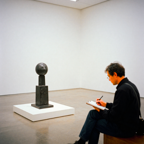
At its core, color theory explains relationships between colors. These relationships help artists create balance, contrast, emphasis, and rhythm within a composition. In gallery settings, this knowledge becomes even more important because lighting, spacing, and surrounding artworks influence how colors are perceived.
Understanding color theory does not limit creativity. On the contrary, it frees artists from guesswork. When color choices are intentional, the artwork communicates more clearly, and the viewer’s experience becomes stronger and more memorable.
A Brief History of Color Theory in Fine Art
Color theory did not appear overnight. It developed through centuries of artistic experimentation and scientific observation. Early artists relied on intuition, but over time, thinkers such as Isaac Newton, Johann Wolfgang von Goethe, and later modern artists began to formalize how color works.
Newton’s color wheel was one of the earliest breakthroughs, showing how colors relate through light. This discovery influenced painters who began to see color as a system rather than isolated pigments. Later, artists like Johannes Itten and Josef Albers expanded color theory into emotional and psychological territory.
In gallery practice, historical knowledge of color theory helps contextualize artworks. When viewers understand how artists from different periods used color intentionally, the artwork becomes more than decorative—it becomes a conversation across time.
The Color Wheel Explained: Primary, Secondary, and Tertiary Colors
The color wheel is the backbone of any step-by-step guide to understanding color theory. It visually organizes colors in a way that reveals their relationships. This tool is simple, yet it carries immense practical value for artists at all levels.
Primary colors—red, blue, and yellow—are the building blocks. They cannot be created by mixing other colors. Secondary colors emerge when primary colors are combined, resulting in orange, green, and purple. Tertiary colors are formed by mixing a primary color with a neighboring secondary color, creating more nuanced hues.
In professional gallery environments, understanding the color wheel helps artists predict how their work will interact with lighting and surrounding pieces. Colors do not exist in isolation; they influence and reshape each other in subtle ways.
Step-by-Step Guide to Understanding Color Theory
Understanding Hue, Value, and Saturation
Hue refers to the actual color itself, such as red or blue. Value describes how light or dark that color appears, while saturation indicates its intensity. These three elements define every color we see in art.
In gallery lighting, value becomes especially important. A color that appears vibrant in a studio may flatten under exhibition lights if its value range is limited. Artists who understand this avoid unpleasant surprises during display.
Mastering hue, value, and saturation allows artists to control depth, contrast, and focus. These qualities guide the viewer’s eye and shape the emotional tone of the artwork.
Learning Warm vs. Cool Colors
Warm colors such as reds, oranges, and yellows tend to advance visually, creating energy and movement. Cool colors like blues and greens recede, offering calm and spatial depth.
In curated exhibitions, warm and cool colors are often balanced intentionally. A painting dominated by warm tones can feel overwhelming if not grounded with cooler elements.
Artists who understand temperature can manipulate space, atmosphere, and emotional response without changing composition. This knowledge is essential in both traditional and digital art.
Exploring Color Relationships
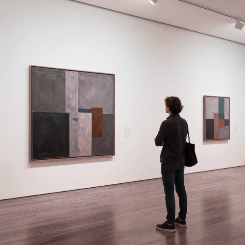
Color relationships explain why certain combinations feel natural while others feel disruptive. Complementary colors sit opposite each other on the color wheel and create strong contrast. Analogous colors sit next to each other and create harmony.
In gallery critique sessions, weak color relationships are often the first issue identified. Strong technical execution cannot compensate for poor color interaction.
Understanding these relationships helps artists make confident decisions and avoid accidental clashes that distract viewers.
Creating Balance and Harmony
Color balance ensures that no single color dominates unless intentionally designed to do so. Harmony creates a visual flow that keeps the viewer engaged.
In professional art spaces, balanced color compositions hold attention longer. Viewers feel comfortable spending time with the artwork, exploring details rather than reacting defensively.
This step is where color theory transitions from technical knowledge into artistic maturity.
Using Color to Create Mood and Emotion
Color is one of the most powerful emotional tools in art. Subtle shifts in color can transform a peaceful scene into a tense one or turn a neutral subject into an emotional statement.
Gallery visitors often describe how a piece “feels” before they describe what it depicts. That reaction is driven primarily by color choices.
Artists who understand emotional color use are able to communicate without relying heavily on subject matter alone.
Color Harmonies Every Artist Should Know
Color harmony refers to pleasing combinations that create a sense of order. Common harmonies include complementary, split-complementary, triadic, and monochromatic schemes.
Each harmony serves a different purpose. Monochromatic palettes create subtlety and elegance, while triadic schemes offer vibrancy and balance.
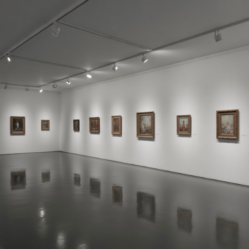
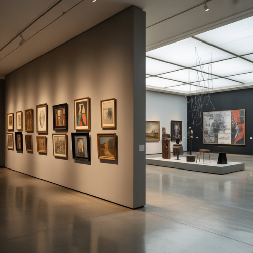
In curated collections, harmonious palettes allow multiple artworks to coexist without visual conflict. This is why galleries pay close attention to color relationships across exhibitions, not just within individual works.
The Psychology of Color in Art and Gallery Spaces
Color psychology explores how colors influence perception and behavior. Blue often conveys calm and trust, while red can evoke urgency or passion. These responses are not accidental; they are deeply ingrained.
In gallery environments, wall colors, lighting tones, and artwork palettes are selected carefully. The wrong color environment can alter how art is perceived, regardless of quality.
Artists who understand color psychology gain a strategic advantage. Their work communicates intentionally, influencing how viewers feel, remember, and interpret the piece.
How Master Artists Use Color Theory
Master artists do not use color randomly. Every choice is intentional, even when the result appears spontaneous. In gallery practice, it becomes clear that experienced artists understand how color carries structure beneath the surface of expression. Their work feels confident because the color decisions support the concept rather than compete with it.
Artists such as Claude Monet used color to capture light rather than form, while Mark Rothko relied on color alone to evoke emotional depth. These artists understood that color could become the subject itself. Their mastery came from knowing when to simplify and when to intensify.
In professional exhibitions, artworks that demonstrate strong color theory often require less explanation. The viewer connects intuitively, guided by visual harmony and emotional clarity.
Common Color Theory Mistakes and How to Avoid Them
One of the most common mistakes artists make is overusing saturated colors. While strong colors can be engaging, too much saturation overwhelms the viewer and diminishes focal points. In gallery settings, overly saturated works often struggle under professional lighting.
Another frequent issue is ignoring value contrast. Artworks may contain beautiful colors but lack depth because the values are too similar. This causes compositions to feel flat, even when technically well executed.
These mistakes are avoidable through consistent study and observation. Artists who revisit the fundamentals of color theory continue to refine their work over time, regardless of experience level.
Applying Color Theory in Paintings, Digital Art, and Exhibitions
Color theory applies differently depending on the medium. In traditional painting, pigments interact physically, creating subtle variations. In digital art, color appears through light, which requires careful calibration to avoid unintended shifts.
In gallery exhibitions, color theory extends beyond the artwork itself. Wall color, spacing, and lighting influence how colors are perceived. A well-curated space enhances artwork without overshadowing it.
Artists who understand these variables create works that translate successfully from studio to exhibition, maintaining their intended impact.
Practical Color Theory Exercises for Artists
Practice is essential for internalizing color theory. One effective exercise involves creating value scales using a single hue. This trains the eye to recognize subtle shifts in light and dark.
Another useful exercise is recreating master artworks using limited palettes. This reveals how artists achieve complexity through restraint rather than excess.
In gallery education programs, these exercises consistently produce noticeable improvement in color confidence and decision-making.
How Understanding Color Theory Improves Art Appreciation
Color theory does not only benefit artists; it transforms how viewers experience art. Once viewers understand basic color relationships, they begin to notice intention rather than decoration.
Gallery visitors who understand color theory engage more deeply. They spend more time with artworks, ask better questions, and form stronger emotional connections.
This deeper appreciation strengthens the relationship between artist, artwork, and audience.
Color Theory Tips from Professional Art Galleries
Professional galleries prioritize color cohesion across exhibitions. Works are selected and arranged to complement one another, creating a unified visual experience.
Artists submitting work to galleries benefit from understanding this process. Pieces that clash visually with other works, even unintentionally, are less likely to be selected.
Strong color theory increases an artwork’s adaptability, making it more appealing in curated environments.
Frequently Asked Questions About Color Theory
Many artists ask whether color theory limits creativity. In practice, it does the opposite. Understanding the rules allows artists to break them with purpose.
Another common question concerns natural talent. While some individuals have a strong instinct for color, mastery comes from study and application, not chance.
Color theory is a skill developed over time, not a fixed ability.
Final Thoughts: Mastering Color Theory Step by Step
Color theory is not something learned in a single session. It develops gradually through observation, experimentation, and reflection. Artists who approach it step by step build confidence rather than confusion.
From a gallery professional’s perspective, strong color theory is one of the clearest indicators of artistic maturity. It signals intentionality, awareness, and respect for the viewer’s experience.
This step-by-step guide to understanding color theory is not an endpoint but a foundation. With continued practice, color becomes not just a visual element, but a powerful language within art.